
Each December, Pantone steps up to its self-appointed throne and declares the colour that will supposedly shape the year ahead. Trends shift, designers react, and suddenly that shade is everywhere — on runways, product packaging, Instagram moodboards, and the nearest overpriced vase.
But 2026’s pick? Cloud Dancer, a soft, chalky, barely-there white. And honestly… I think it’s a pretty underwhelming choice, says style director Louise Hilsz.

A Blank Canvas — But Not Much Else
Pantone describes Cloud Dancer as “a whisper of tranquillity,” a hue that represents calm, clarity, and simplicity. In theory, lovely. In practice? It’s white. A muted, timid white that feels more like a primer coat than a statement. In a world bursting with saturated, expressive colour, choosing a nearly-neutral shade feels like a cop-out. After years of unpredictable cultural shifts, maybe Pantone wanted a reset — but Cloud Dancer lands more as an absence of colour than a vision for the year ahead.
The Trend That Wasn’t
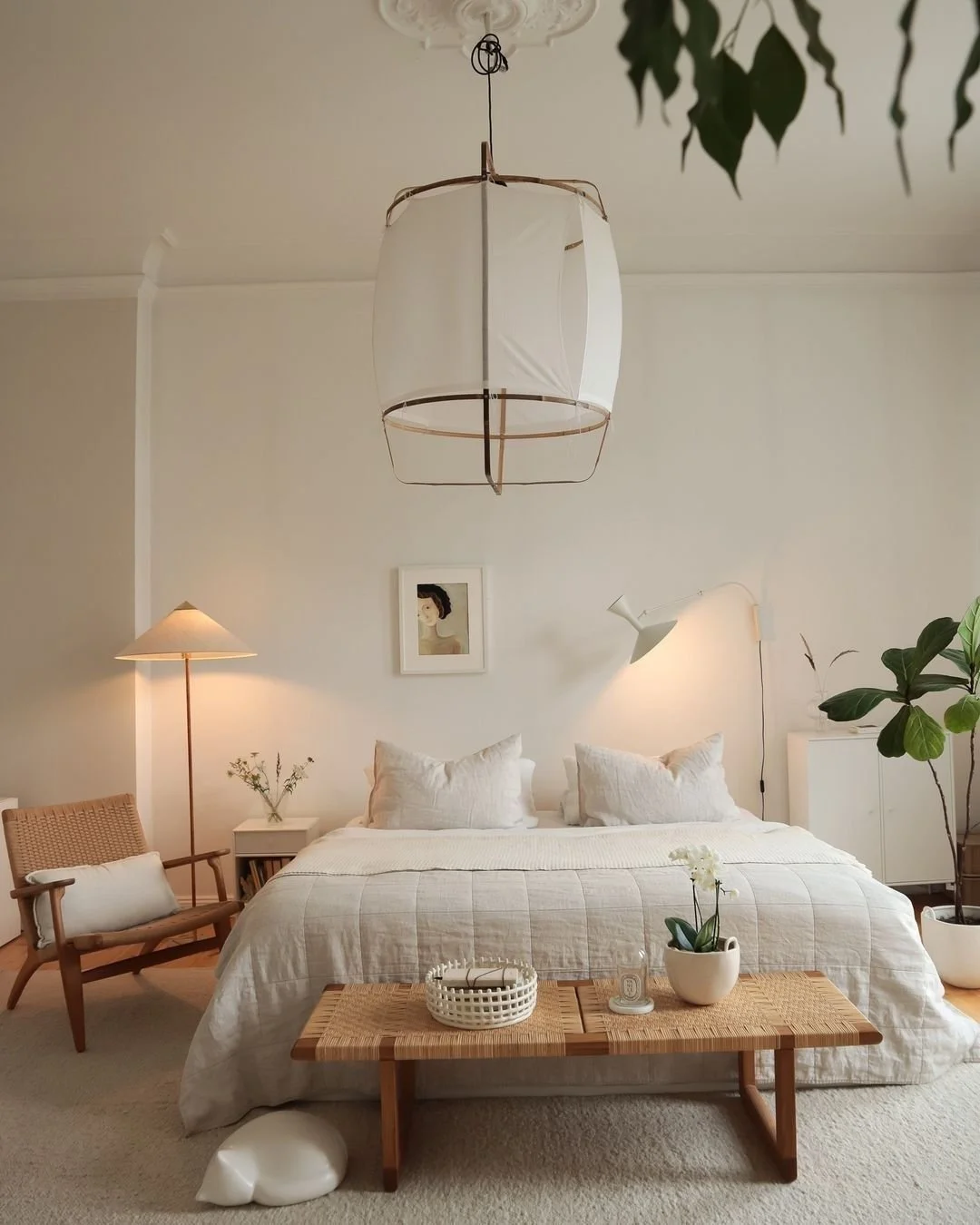
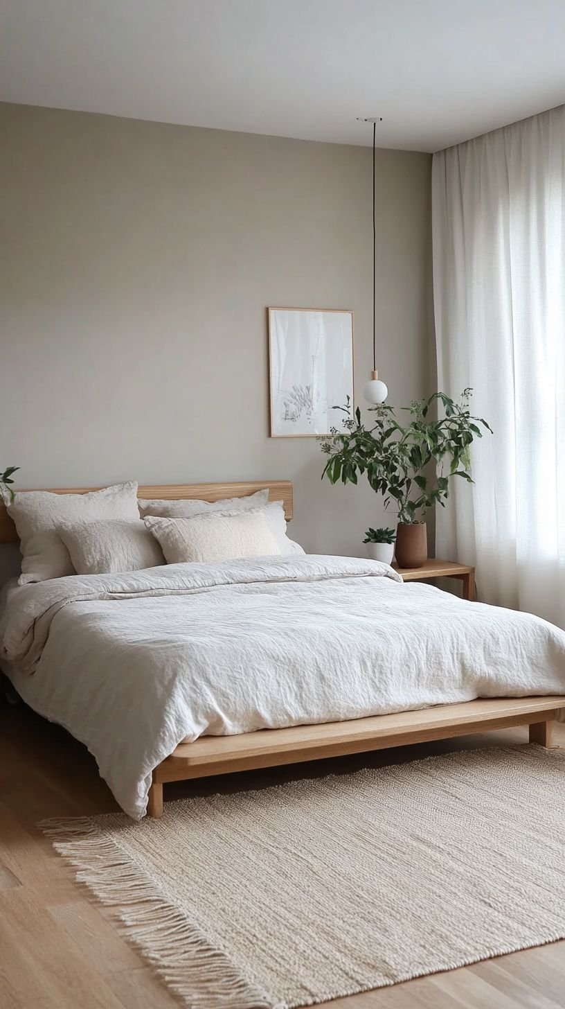
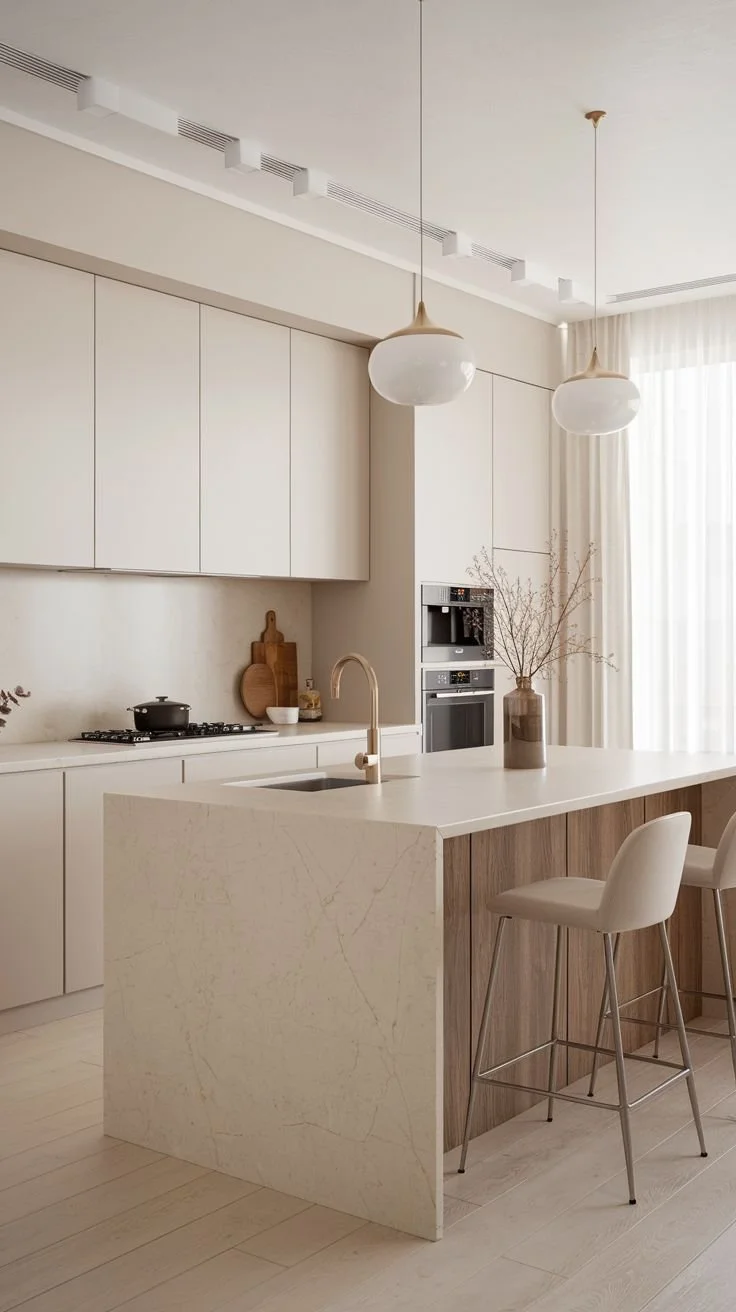
Designers are already calling it serene and airy, but let’s be honest: white’s been “in” since forever. You can’t scroll a design feed without hitting a minimalist white living room or yet another alabaster perfume bottle. Colour of the Year is meant to spark something new — an energy, a mood, a direction. Instead, 2026 gives us… the colour of untreated linen. The colour of the default paint. The colour of “I’m scared to commit.”
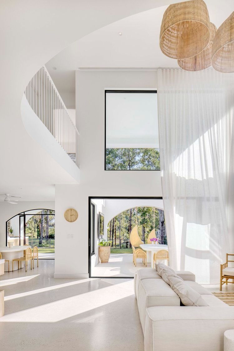
Resene white paints


Resene Alabaster paint, Resene Black White paint, Resene Cotton Wool paint and Resene Eighth Blanc paint available from Resene ColorShops.
A Missed Opportunity for Boldness
Pantone has the power to shift global colour trends. This could’ve been a chance to champion something vivid: a fiery red, a mineral green, a citrus tint or the rumoured transformative teal that actually had personality. Something that reflects women reclaiming space, creative industries thriving again, and culture rediscovering joy. Instead, Cloud Dancer is the tonal equivalent of a sigh.
Why It Will Still Take Over (Even If It’s Boring)
Despite the snooze option, brands will still use it. Fashion labels will release soft white knits. Beauty brands will roll out “Cloud Dancer” compact cases. Interiors will lean further into the plaster-washed, chalky aesthetic. Because that’s what Pantone does — it moves the market, even when the colour doesn’t move you.

Final Thoughts
Maybe Pantone wanted peace. Perhaps they wanted purity. Or maybe they ran out of ideas. Whatever the intention, Cloud Dancer feels like the least exciting Colour of the Year in a long time — a safe, subdued pick that whispers when the world is ready to shout.


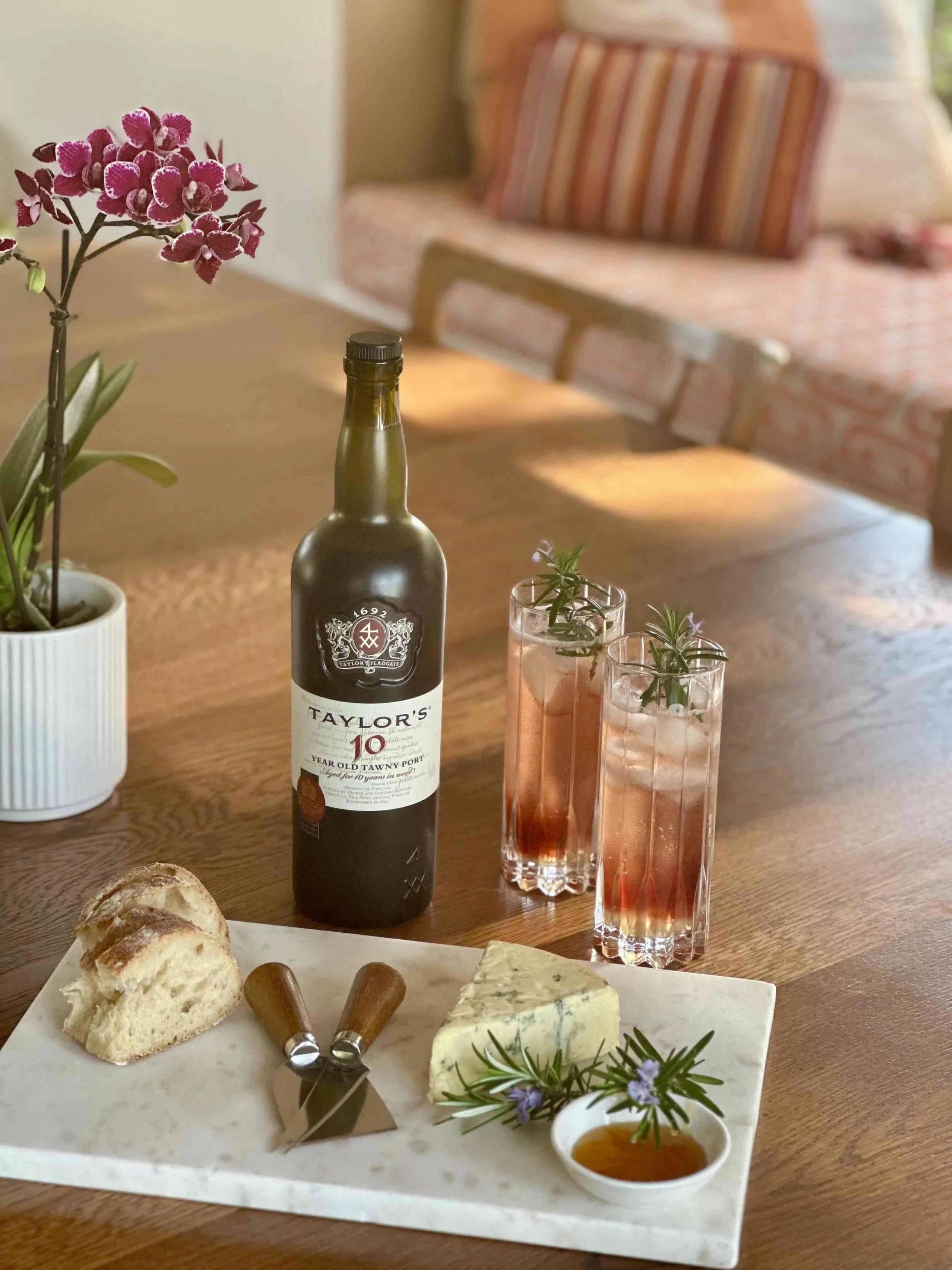


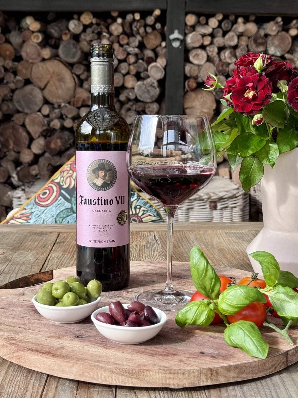
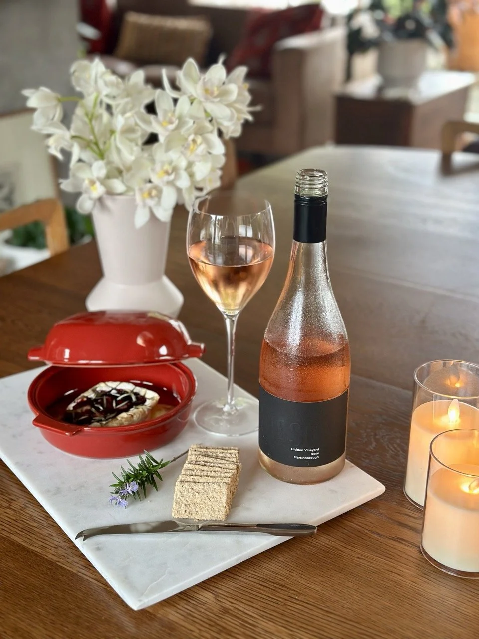


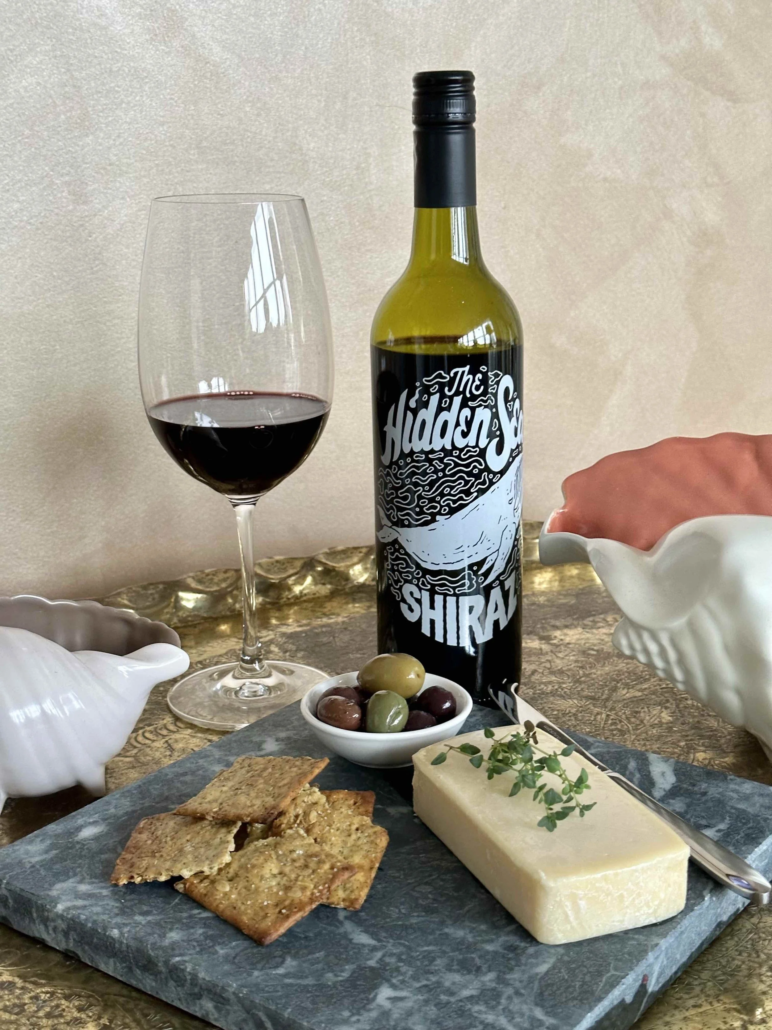
Here’s three that pair perfectly with winter’s comfort food.